PART ONE - DRAWING AND INKING
I've always wanted to make a tutorial of my comic making technique, so now is the time. This is part one about sketching and laying out the page, as well as inking. Part two will be about coloring, shading, special effects etc.
STEP ONE - Create panels
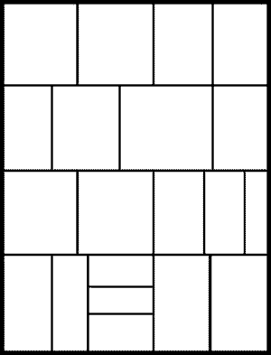
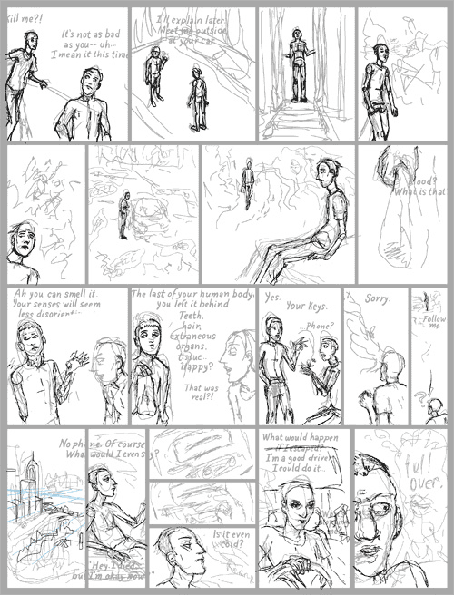
Here I've created a blank page using the rulers in Photoshop. I've decided on a certain image size that I always use that is much much larger than the finished comic page. This allows me to add a lot more detail. (Sometimes too much...) Occasionally I do this step after I've sketched, and make the panels fit the drawing. The black lines are on their own layer. You can never have too many layers.
STEP TWO - Add text
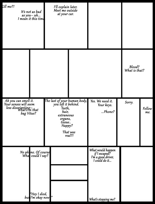
Now I fill in the dialogue. I have a script that I have prewritten several chapters, though sometimes I make slight changes. I start with a font that I always use, I will draw over the top of it later. I chose this font for its similarity to my handwriting, and I wanted a certain cursive-esque feel to the lettering in this comic. This step is useful for having even spacing and keeping the letters straight.
STEP THREE - Sketch
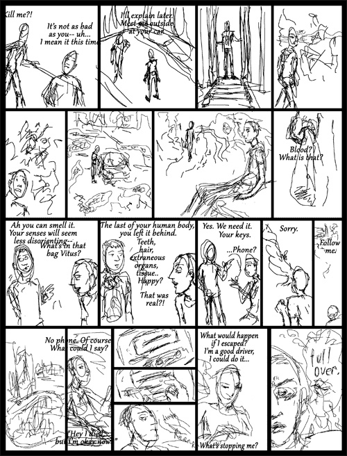 
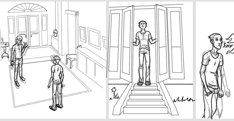
A very important step! I used to do this part by hand, printing out the blank page and drawing in pencil. It is faster to do it with the tablet. I try to vary the shots for interest, move from far away to close, have plenty of background and establishing shots. These are things many artists skimp out on, but adds so much to the world and feeling of a comic. Sometimes I have a tiny hand drawn sketch of the page, that I use as reference.
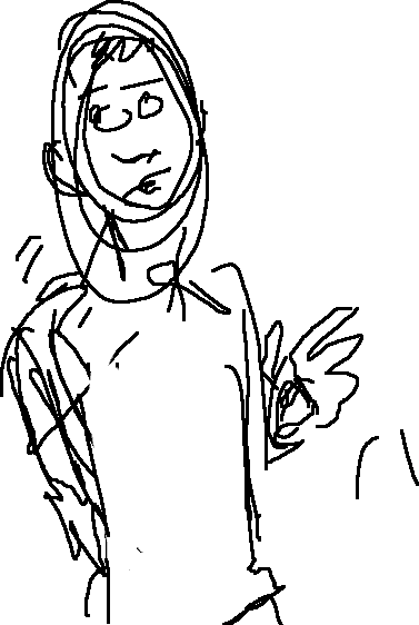
The idea here for the drawing is to be expressive, and block out the actions. I don't worry a whole lot about anatomy at this point. You really can't beat the hilarity of some of the drawings (see right.) I keep very loose and scribbly and I think this helps the expression. This takes maybe twenty minutes.
STEP FOUR - Lighten
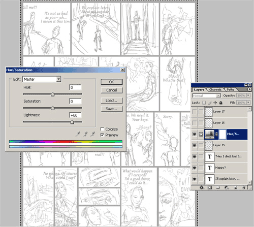
Here I use a hue/saturation adjustment layer to lighten the whole image, so I can draw further on top. This is akin to laying a paper on a light table. I always work in many many layers so I can easily make fixes or go back to old versions.
STEP FIVE - Lettering
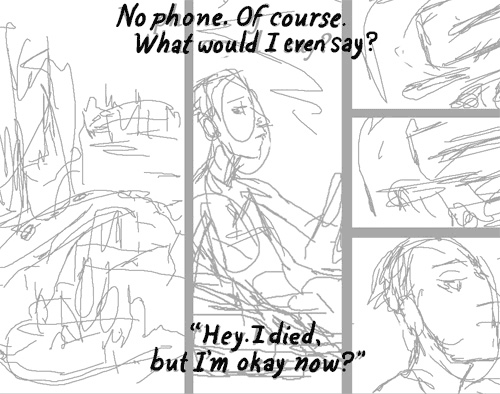
I get the lettering out of the way. This is a very fast step, probably five minutes. I think hand drawn text fits the drawing much better, and has lot more character than a simple font. In the past I always worked in traditional media so I like my digital art to look as hand done as possible. I really recommend this step for all comic artists, it's not hard. I draw all the text in black, if it is another color I will change it in the coloring process.
STEP SIX - Refine sketch
 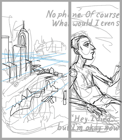
Here I do some refining to the drawing on another layer. I add details, and try to focus on structure. The earlier sketch has bizarre anatomy and other problems and I here I try to work them out. I want to keep the character and feeling of the earlier sketch while providing more realistic 3-dimensionality. (Sooo fancy.) See detail on right, me trying to work in perspective, ugh.
It's handy to draw your characters nude-esque before adding clothes to them, it will mitigate any anatomy problems. I try to be critical here, make sure that the characters stay on model. It helps to have very defined ideas of what your characters look like, the shape of their skull and hair, facial features etc. Vitus will never look like Jack for instance.
STEP SEVEN - Reference
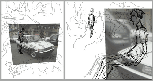
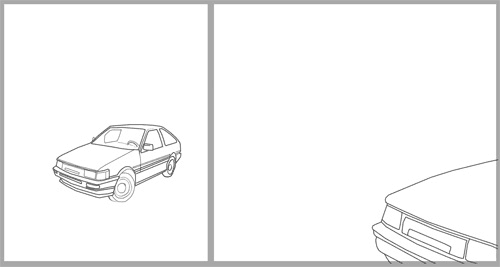
Here I find and place reference photos. I generally only do this for cars, and backgrounds/furniture. I particularly hate drawing cars by hand, and have done it enough in the past to know I never want to do it again. Here Jack apparently drives a Glennish version of a 1987 Toyota Corolla. It's important to distort the photos properly so they fit into the scene, avoid building a scene to match the perspective of a photo, it's a nightmare.
Here I've drawn on top, and run a victory lap. Decided to flip the first car to match the following panel.
STEP EIGHT - Inking
A very treacherous part! I call this inking because in traditional comic technique, the earlier bits would be done in pencil. Instead of the loose scribbly style, I use a fatter brush and take my time, tracing the sketch on a new layer. I vary the pressure to create depth, more important edges are thicker, etc. I tend to flip the entire canvas while inking, so I can catch any mistakes or distortions. (Akin to a painter using a mirror to look at their painting.) This step can take an hour or two.
Here a detail. I lay down some thin lines for backgrounds. To draw straight lines I hold shift and click from point to point. Notice how I've changed from my original sketch a bit, moving characters around to fit better, and stay in scale.
SECRET TIP
 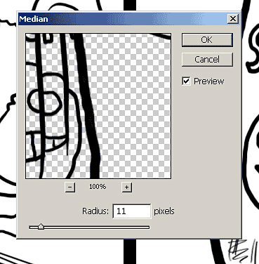
After inking, you may notice a lot of wobbly lines. I recommend working in a huge file, and zooming in as much as you can stand to avoid this. It still happens though, but some of it will smooth out when you shrink the image. To fix some shakiness, I will select the bumpy part, and use filter>noise>median setting the radius as high as I can without fading the line or distorting it. Sometimes it helps to only select one half of the line, instead of the whole thing.
STEP NINE - Word balloons
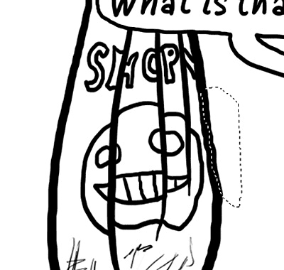
Frankly I just freehand these, they tend to be a bit wobbly but I don't mind. Again, character! Right? Right? A lot of people use vector images for this, but that is too much work to me, and too sterile. If you draw them fresh each time you can draw goofy ones like the one in the first panel, or add expressive bits. (Icy, nervous, shouting, etc.)
STEP TEN - Complete
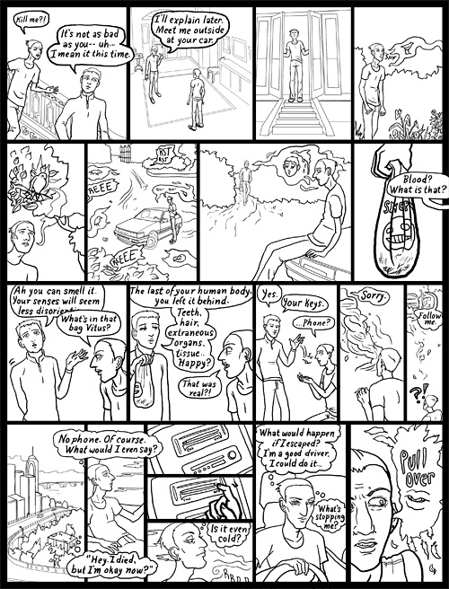
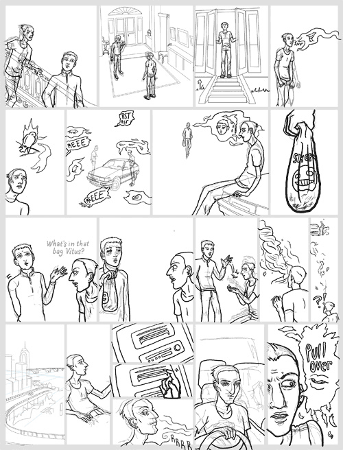
I smooth out edges, thicken spots, erase background lines, erase bits of the borders that go behind balloons... Here is my finished, coloring book style page.
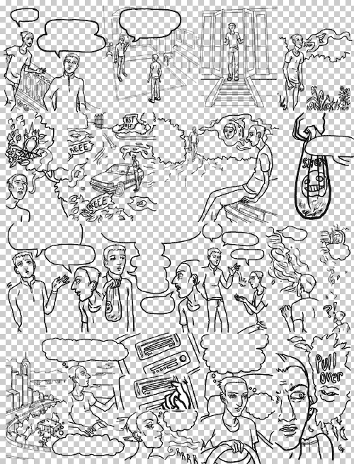
What it looks like without the background white and borders. It's important to not have anything other than black here for the coloring process. I collapse all the lines into this single layer, and save a new file. (I actually save new files as I go along quite frequently, good for accidents.) Notice that the text is hidden, it's easier to fill the white of the balloons without the text getting in the way.
So end of part one! Watch out for the part two, on coloring and shading. |